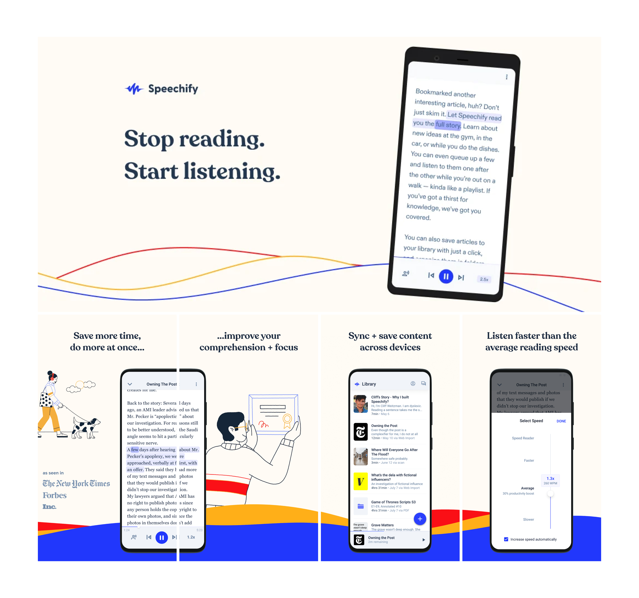
Speechify – Product Design Case Study
Reimagining onboarding to 2x paid conversion

Background: A new Android app
When I joined Speechify as the company’s first Senior Product Designer in Spring of 2021, my first project was designing the Android app from the ground up. At the time we had an iOS app that could serve as a reference, but the user experience was a bit of a mess. And although the onboarding had proven to be fairly effective (around 10-12% conversion), the consensus both from users and internally was that it was overly long, and not effective at educating people how to use the product.
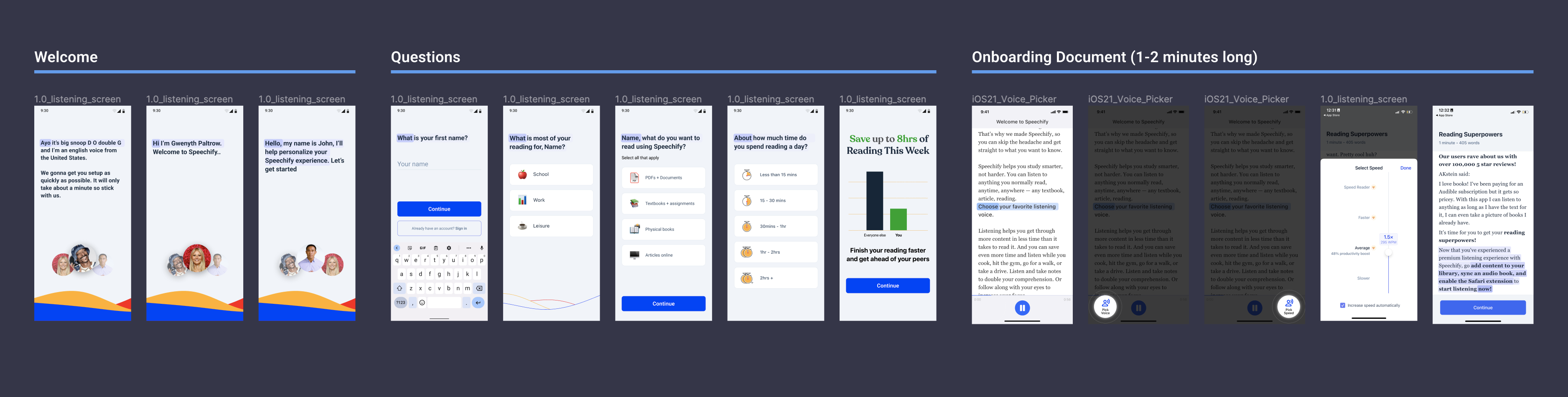
My mandate was to keep what worked from the iOS app, and redesign what didn’t. Although I pushed for an opportunity to redesign the onboarding, we made a team decision to keep what was working about the iOS app, so we kept onboarding the same to prioritize parity. After a few months of iterating on the design and working with the team of two engineers, Sourav and Imrane, we launched Speechify for Android in Fall 2021.
Speechify for Android launched in Fall 2021
Situation: Stagnant growth
At launch, onboarding was around 2% conversion rate, about a fifth that of our iOS app. Although the app was still in early stages and feature-light, we knew we had huge room for improvement. At Speechify, onboarding was an area of constant experimentation, always trying new things to move the needle on install-to-trial and install-to-paid. Over the next year, we ran various onboarding experiments which had raised our baseline conversion to 3%, but we found it difficult to outperform this number.
After months of hovering around 3% conversion rate, we eventually turned off our paid user acquisition ads for Android, as it had stopped being profitable to the business. As a result, user growth began to stall. Our goal was to increase user conversion significantly, but after struggling to achieve meaningful improvements despite ongoing experimentation, we knew we had to try a different approach to move the needle.
Identifying the issues with data and analysis
As a startup with a team of 4, we didn't have unlimited resources, but we knew we could gain a lot of crucial information and validation with what we had available: analytics, user research, and relevant reading. Along with the PM, Natalie, we dove into Amplitude to see where exactly the major drop-offs were occurring in the flow, and whether or not our current flows were leading to the desired outcomes of having first-time users upload files. We also spoke to dozens of users, both current new users of Speechify and people who had never seen the product before to obtain qualitative data.
We also read “Better Onboarding” by Kristal Higgins as a team to educate ourselves on how to design a better and more effective onboarding. One of our main takeaways from this book was the concept of “guided interaction” rather than front-loaded information — walking the user through their first key action together, rather than bombarding them with information upfront (which is often ignored or skipped) and then leaving them to use the product. During our research, we began to circle around a few issues that seemed to be the biggest opportunities for improvement:
1
Front-loaded information without guided interaction
We weren't utilizing any tooltips or guided interaction experience — we bombarded users with information, making them answer multiple questions, and then leaving them to figure out what the product is for and how to use it. An alarmingly high percentage of users (over 75%) never uploaded a single file, which our data showed to be the most retentive action.
2
Imbalance of Challenge vs. Reward
Too many questions, upsells, and information (challenges) for users, without enough personalization or delight (reward). This created multiple hurdles in a row for users with little payoff, and it also was taking users too much time (an average of ~3:30) to complete onboarding before getting to use the product.
3
Onboarding felt disconnected and unclear
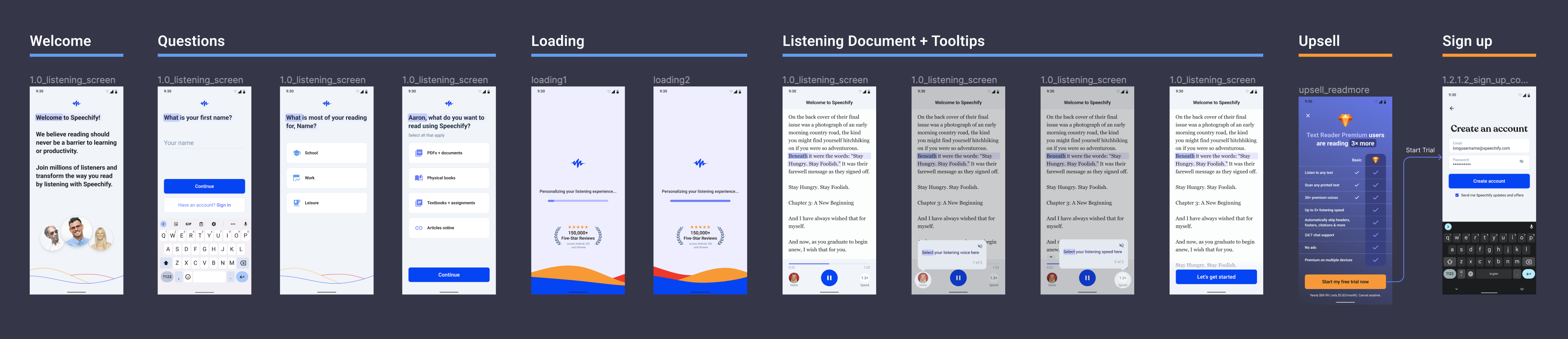
We showed users how to listen to a document, but not how to add their own documents to listen to (the most magical part). Over 2/3 of users reported they did not have a clear idea of what to do when they completed onboarding. Also, the onboarding document experience was proven to work for the product, but we knew we could improve the UI to match the rest of the app.
Designing towards a solution
Now that we had a much clearer idea of what the issues were, we were able to begin documentation and designing what we wanted this new flow to include and achieve:
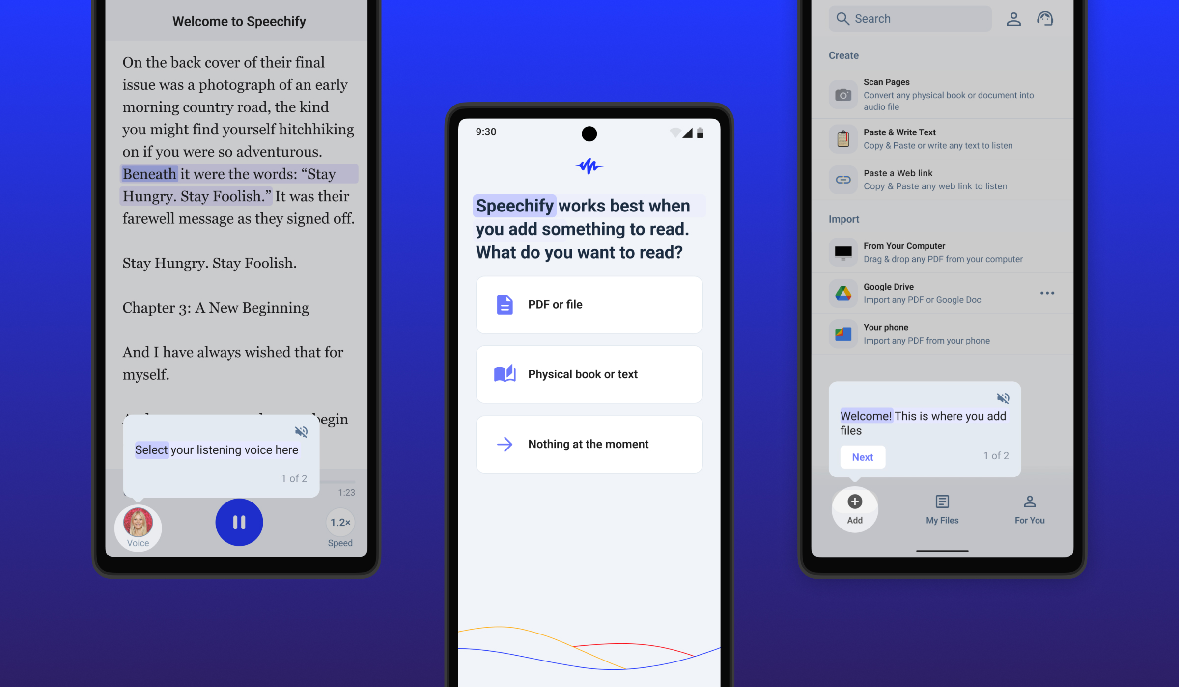
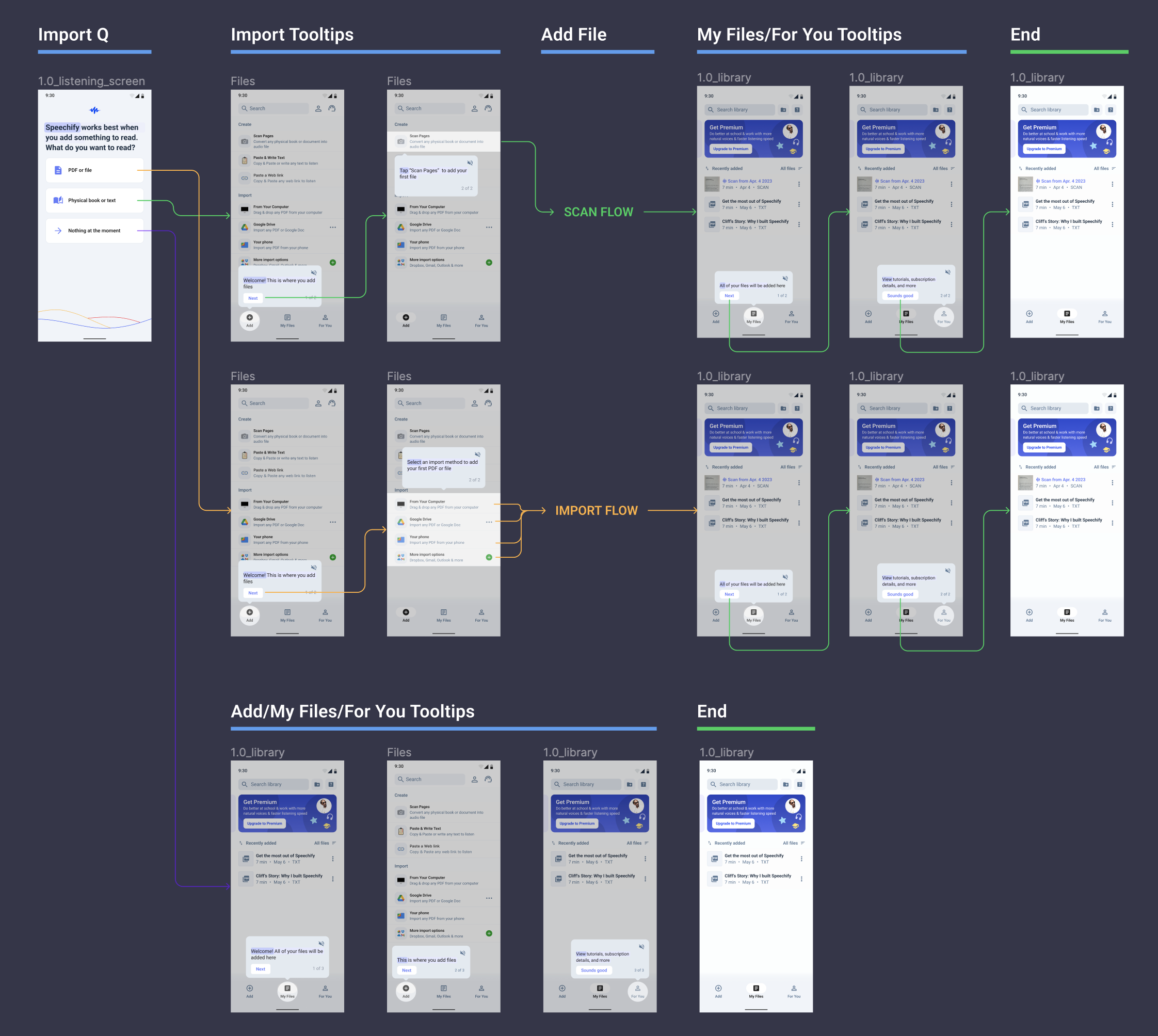
• Bring file import forward in onboarding, since it was the was the most impactful action for new users (those who uploaded a file were 3x as likely to convert to a paid membership)
• Use guided interaction and continued onboarding around the file import process, to anchor new users in the product and highlight key actions they could take upon completion
• Reduce overall number of screens and time spent on onboarding to get user to perform key actions faster
• Improve the onboarding document and make the experience feel more connected by using updated UI that matches the rest of the product
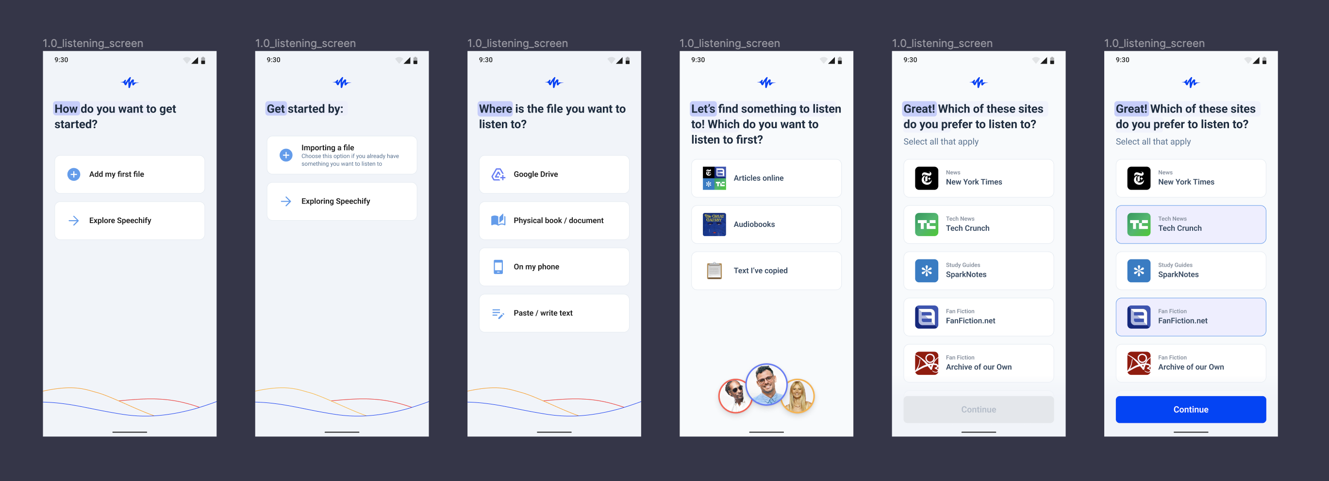
We had multiple ideas about how to guide users through adding their first files, and when during onboarding would be most effective to introduce this complex flow.
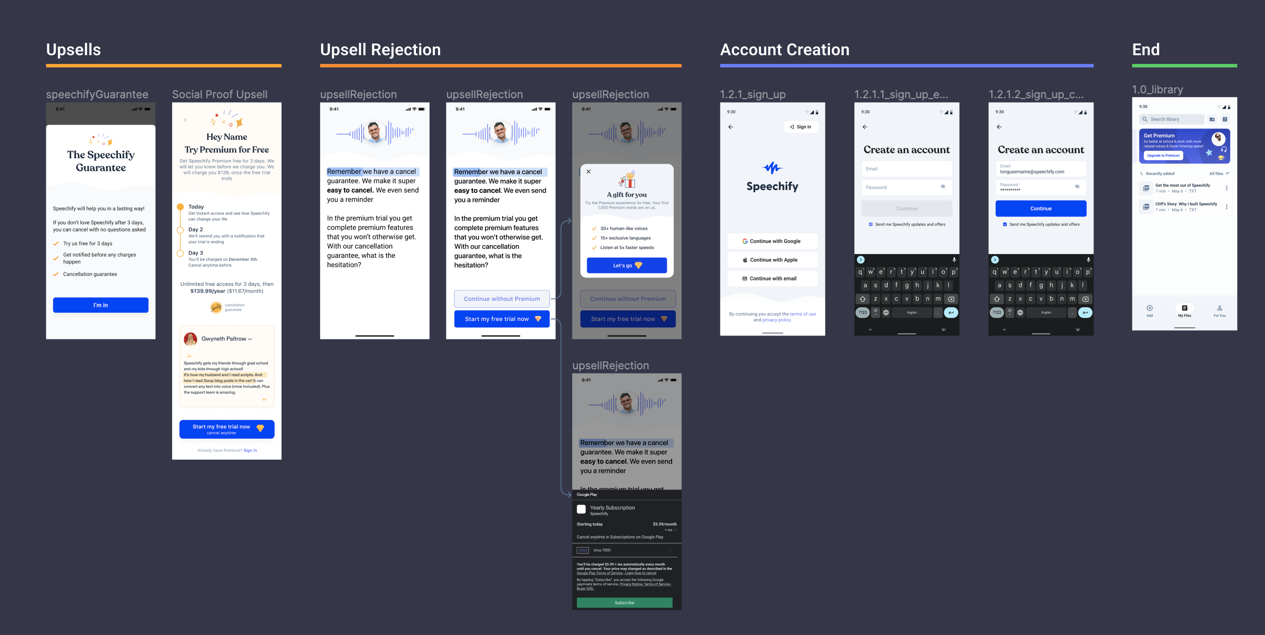
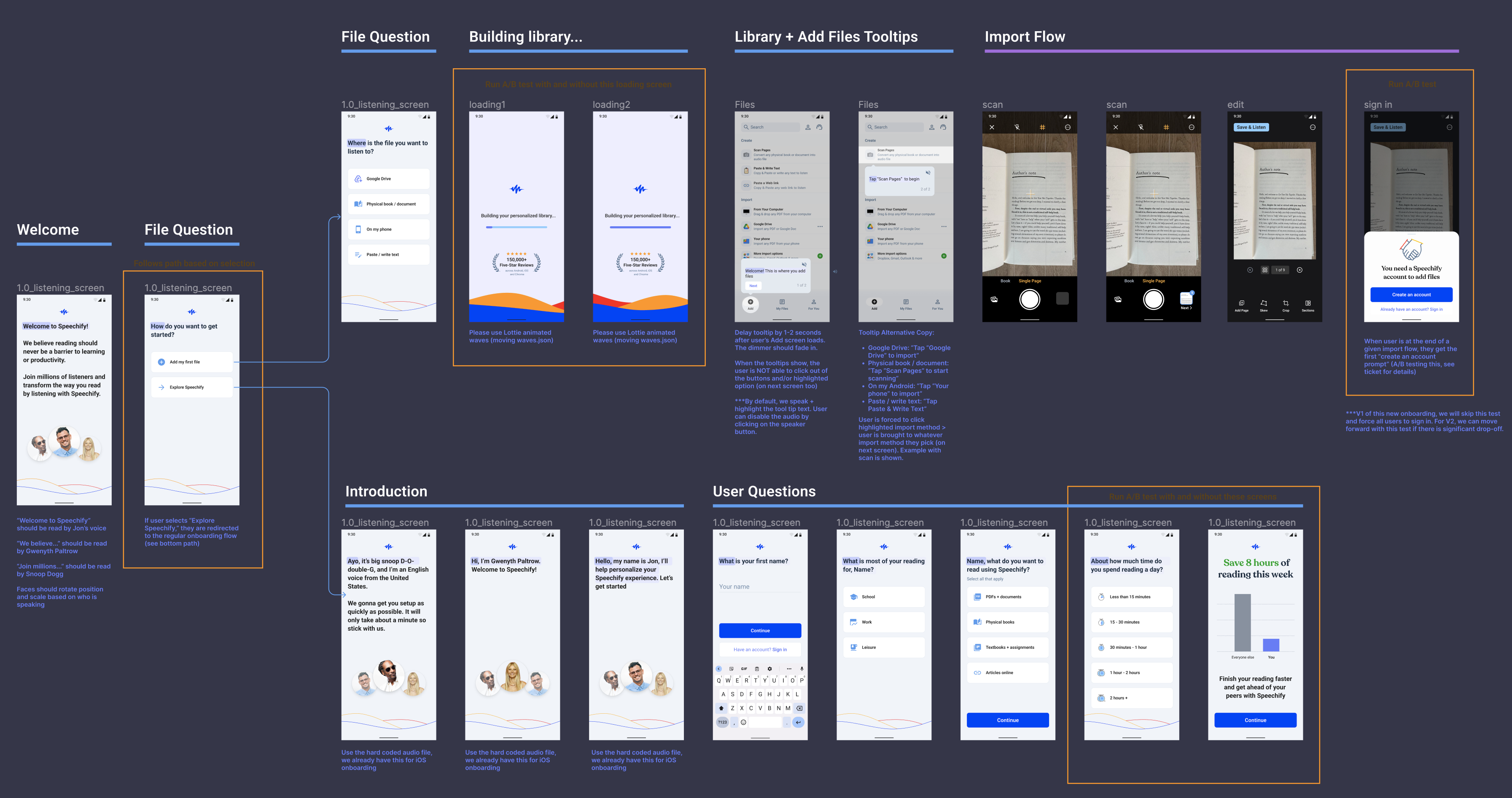
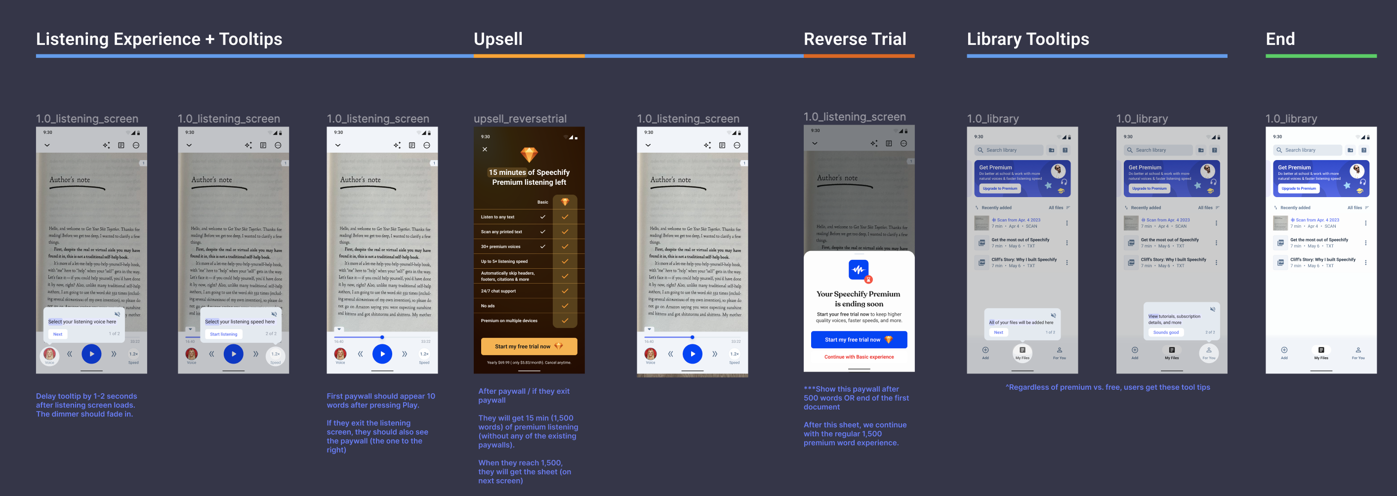
Our first iteration contained most of the key ideas that ended up proving successful, but also introduced some new concepts: forced account creation, and the new reverse trial experiment, starting a new user with a Premium experience, but only for a finite time.
The V1 release of what we began to call “First File Onboarding” launched in May 2023, and saw a conversion rate of 2.7%, slightly below our baseline of 3.0%. Historically, Speechify product teams had been quick to abandon ideas that didn’t immediately outperform the control, but I was adamant that if we have conviction about our hypotheses, that sometimes good ideas just needed to be iterated upon to reach their potential.
As we dug into the data, and although our conversion rate was lower overall, we saw very low drop-off rate for most screens, and that the vast majority of drop-off was occurring at the upsell and the account creation screens. We felt that by removing the experimental ideas (reverse trial, forced auth), and keeping the core ideas that address the issues (shorter flow, guided file import, tooltips, etc), we could reduce drop-off and raise conversion rate.
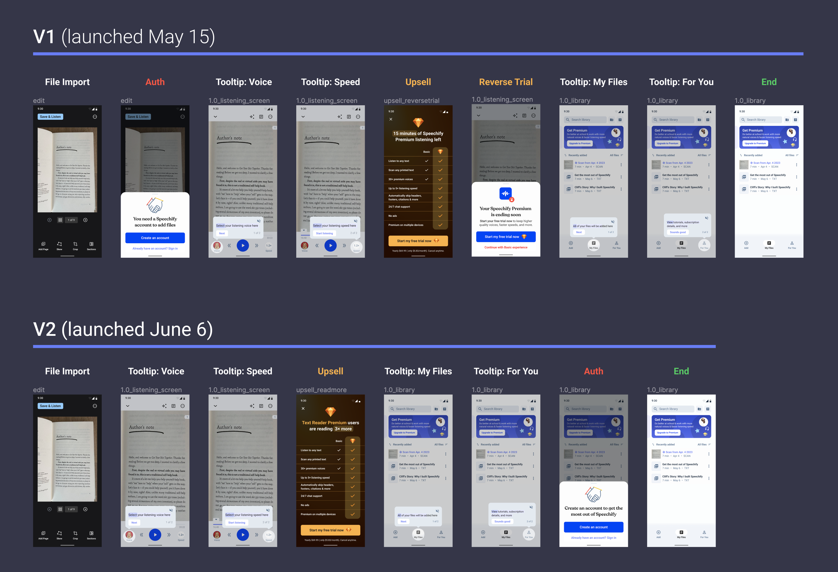
We adjusted the end of the flow to completely remove the reverse trial experiment, and push account creation to much later in the flow, only after users had added a file.
V2 of First File onboarding launched a few weeks later in June, and saw a conversion rate of 2.9%, an improvement over V1, but still not outperforming our baseline significantly enough to warrant a change.
Results: A testament to iteration
After the performance of V2, we knew we were getting closer, but needed a few more iterative tweaks to achieve success.
V3 of First File onboarding launched in July 17, 2023.
After allowing a week to collect data, V3 saw a conversion rate of 5.3%, a 76% increase over the baseline we had been stuck at for almost a year.
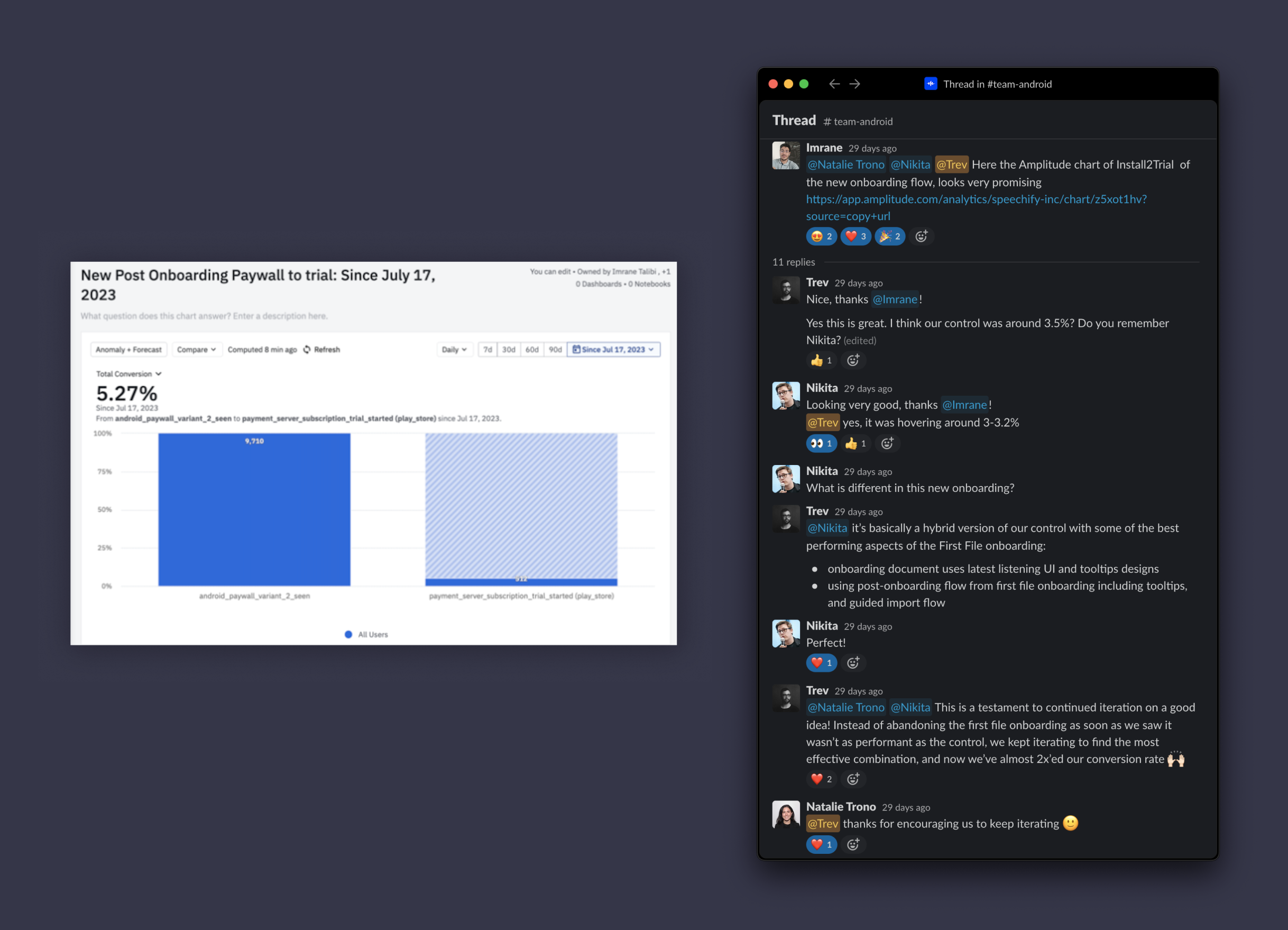
We achieved a conversion rate of 5.27%, a 76% increase. Our team was happy!
• V1 Launch (May 2023): Conversion rate of 2.7%, below baseline but with promising user engagement metrics
• V2 Launch (June 2023): Conversion rate improved to 2.9% by refining the flow and removing experimental features
• V3 Launch (July 2023): Achieved a significant increase to a 5.3% conversion rate, a 76% improvement over the stagnant baseline
We were able to resume paid user acquisition on Android, and our week-over-week growth almost doubled, at a higher conversion rate. Ultimately, not just the results but the process was a big win for the design team, and our product team overall. This example became a reference point and was used as an example by the CEO for continued iteration and conviction behind an idea.
Thank you!