TRASH – Case Study
Designing an AI-powered video editor
The creative promise of AI
I was initially drawn to TRASH because it promised a new mode of creation. Video editing powered by AI and ML, would make video editing — something historically prohibitively expensive and expertise-driven — into something that anyone could do with one button on their phone.
TRASH's video editing tool, Director, was built on an innovative AI/ML network that used "cinema science" to analyze users' disparate inputted video clips for hundreds of variables, and then output a polished single video ready to be shared.
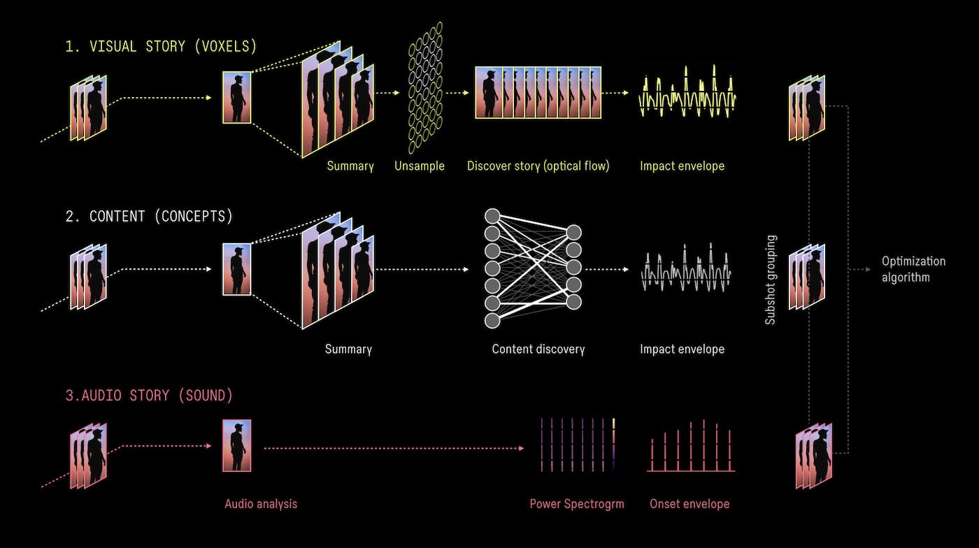
The AI/ML modeling that TRASH's video editing tool was built on
Eventually TRASH aimed to build out its social features and become a full-fledged creative platform for short-form video. The goals were lofty, but we knew that TRASH would not grow until we improved the design of the core editing tool.
Where we were
When I joined TRASH, it was still in a private beta, with 2k users and negligible growth. Users would get excited by the idea, try out the tool, have a moment of delight and then seemed to hit a wall. The app was not growing, user videos weren't being shared enough — there was a disconnect between the idea and execution and it was impacting our growth.
The core of the product was its video editing tool — its capabilities were unique and powerful, but the UI/UX was created a frustrating and confusing user experience. In order for the product to succeed we needed to figure out why this was happening, and how to fix it.
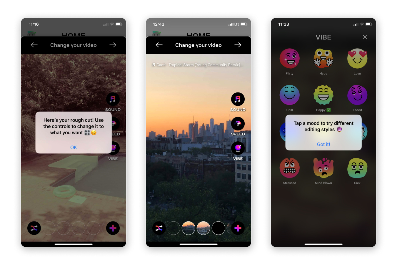
Early versions of the TRASH video editor tool, Director
Identifying the issues
As an early-stage startup, we didn't have unlimited resources, but we knew we could gain a lot of crucial information and validation from getting scrappy with our user research efforts.
The team developed a cadence of weekly in-person customer development sessions, partnered with a UX Research specialist, and conducted ongoing usability studies, creator focus groups and experiments from Fall 2019 onwards to help us identify the major painpoints with the current product and to better understand our users and their needs.
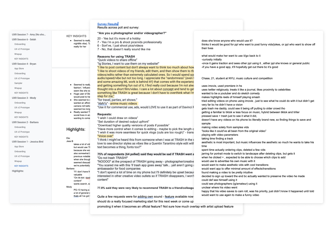
Quantitative and quantitative user research helped inform our design and product roadmaps
1
What even is AI?
Problem: The role and meaning of "AI" was unclear or unimportant to most users. They didn't seem to care about what the AI was doing, or even that it was there — they just wanted a tool that worked and made great videos. We needed to rethink how we communicated the role of AI to our users, from our marketing to our product design.
2
Editing was a tangled mess
Problem: Individual editing parameters like visual filters, pacing, and soundtrack were completely intertwined, and this was not clear to users. While this was initially a choice to reduce complexity, it ended up creating almost universal confusion and frustration. We needed to make sure users felt their actions carried intention and that the results would be somewhat expected.
3
Too much novelty
Problem: Users were getting confused around button labels and interactions that weren't what they were used to. Our branding and video editor were unconventional enough — we needed to find a balance between new and unfamiliar to reduce cognitive load on new users and create a more intuitive experience.
4
One size fits none?
Problem: We wanted TRASH to be a video tool for any type of video, but certain use cases we were seeing called for more control or specific styles of editing. We needed to devise a solution that allowed for different types of videos while still being simple and straightforward to use.
Designing towards a solution
These were some complex and important problems to solve, so we had to get the maximum out of our lean team. Co-founder Han Donovan led product, the other co-founder Genevieve Patterson focused on refining the AI/ML powering the tool, Drew Olbrich led iOS development, while I focused on product design, user research, and visual design. Our workflow was based on whiteboarding, quick iteration, scrappy user testing, and Figma for design and prototyping.
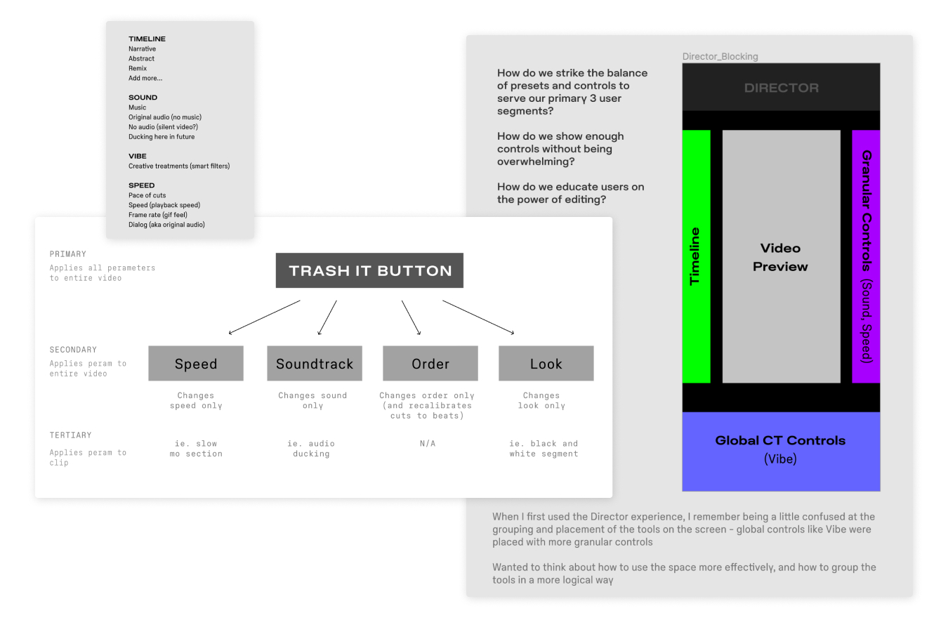
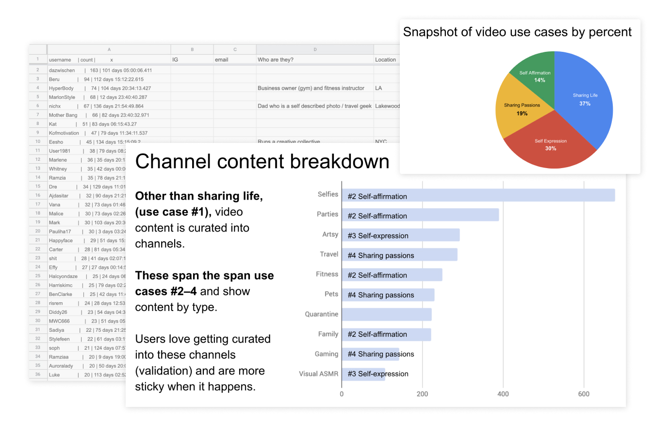
Our process started with documenting the Director components and their relationships to one another. We needed to understand exactly what was happening whenever a user took an action so we could design the optimal experience for that. We also created a breakdown of our top 100 retaining users, analyzing what they were posting and to where, to distill down the top use cases.
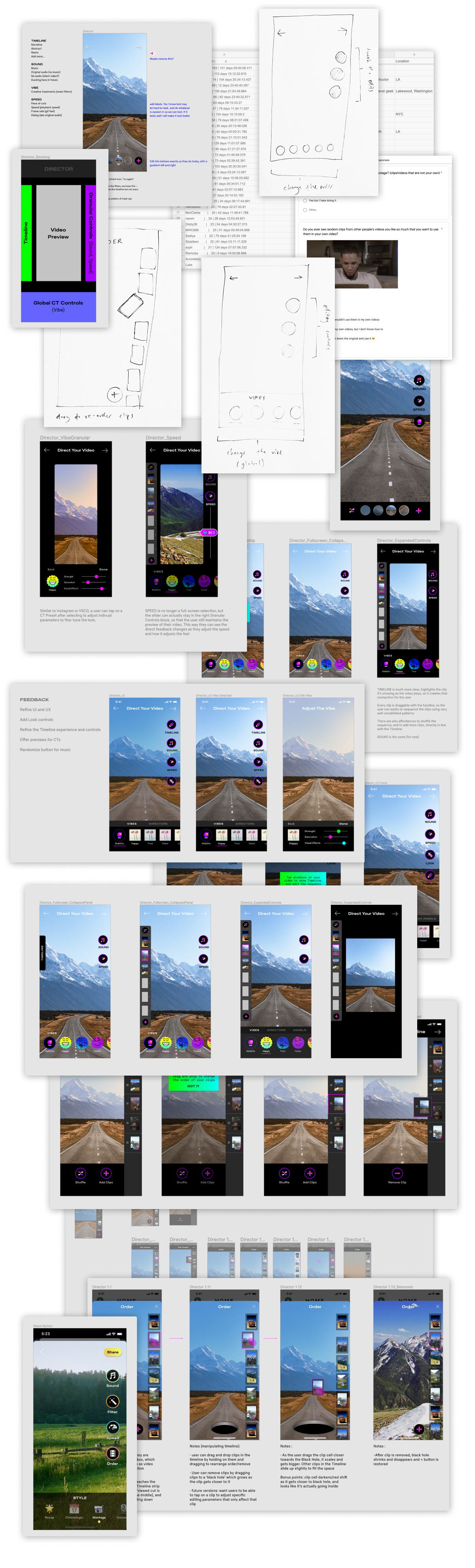
Once we had this documentation, I began redesigning the TRASH video editor tool, iterating and refining over several months from fall 2019 through the spring of 2020.
The New TRASH
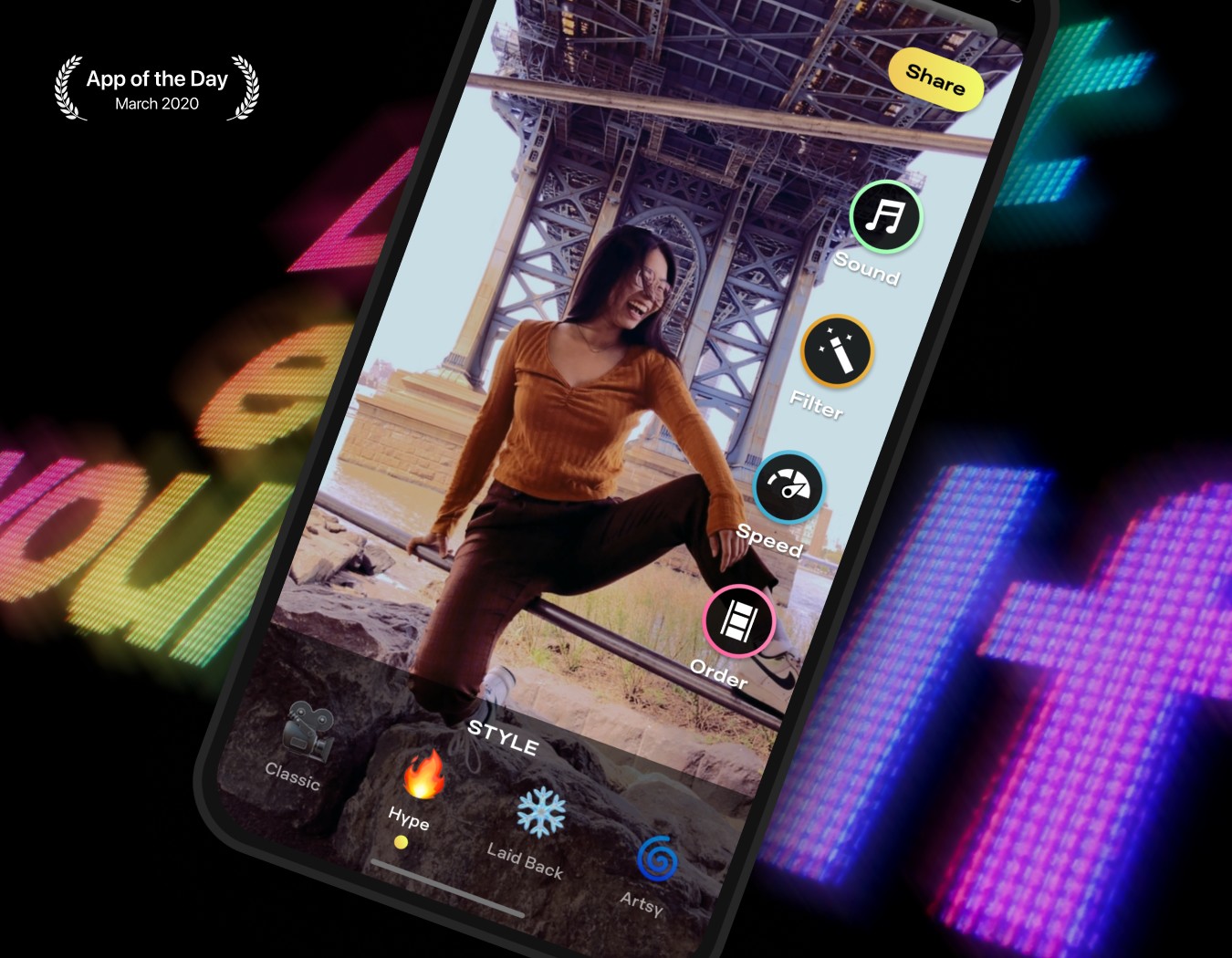
By early 2020, after much iterating, testing, and endless discussion, we aligned on a new direction for the TRASH brand and product. Our lean team was able to make some huge improvements to the TRASH product and platform, which earned us a feature as Apple's App of the Day and a big writeup in TechCrunch.
I also art directed the evolution of our new more mature logo and wordmark to reflect this, inspired by Polaroid and 70's brutalism.
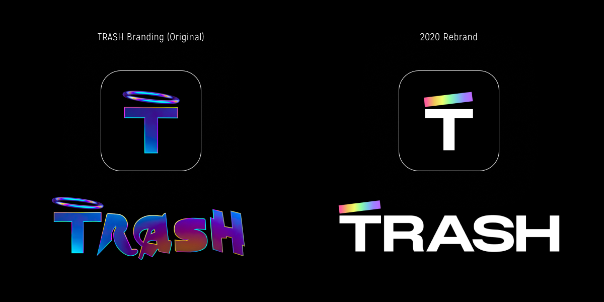
Logo updates reflected a more mature brand while retaining personality. Logo by Simon Whybray
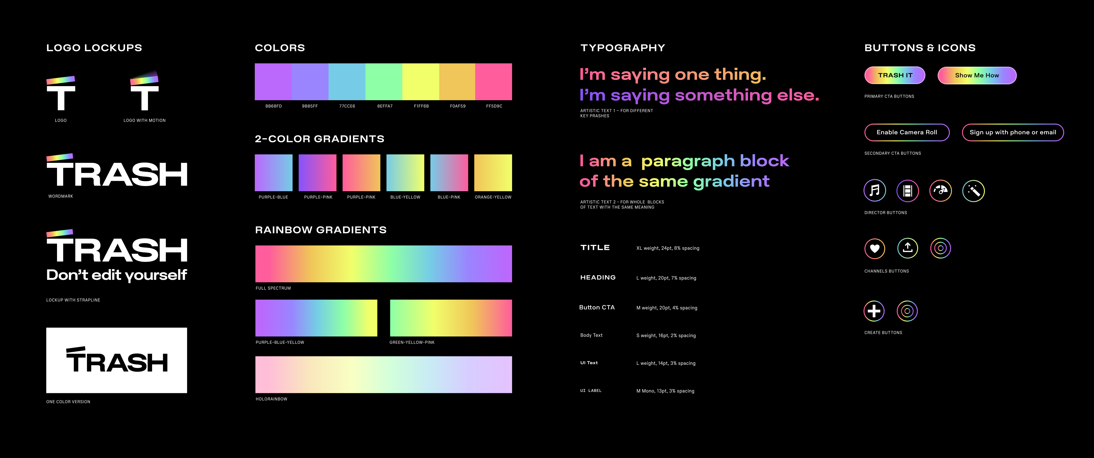
The new TRASH design system
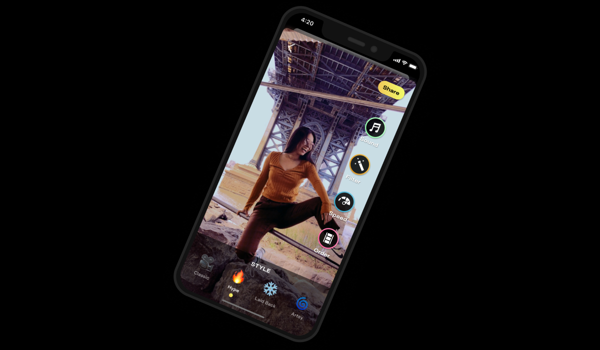
Aside from updating the brand and design system, one of the most crucial improvements we made was untangling and clarifying Vibes and Looks, to create TRASH Styles. We changed the name of "Looks" to "Filters" which is what users were familiar with, and decoupled each parameter to make them independent of one another. This drastically reduced friction and frustration when using the editor.
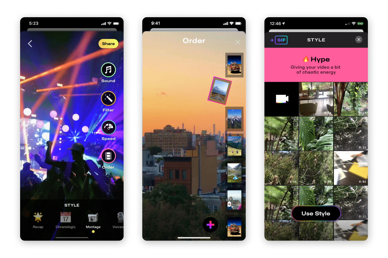
We also launched Styles, a totally new way of editing video. These weren't just templates or filters, like Instagram — these were powerful starting points for our creators to edit with, based on the most common use cases. A whole new vibe for your video is just a tap away.
We also completely rethought and redesigned the Order experience, going from the buggy bubbles on the bottom of the screen to a vertical timeline that could be easily dragged, rearranged, and deleted like an iOS list.
"Look" became "Filter," and now only affected the visual treatment and color grading of the video, as it should have all along.
Users could also see what Styles other creators used on each video, and could actually create their own video directly from there, creating additional paths to creation from the consumption experience. This was a big improvement, resulting increased videos posted per day.

Thank you!